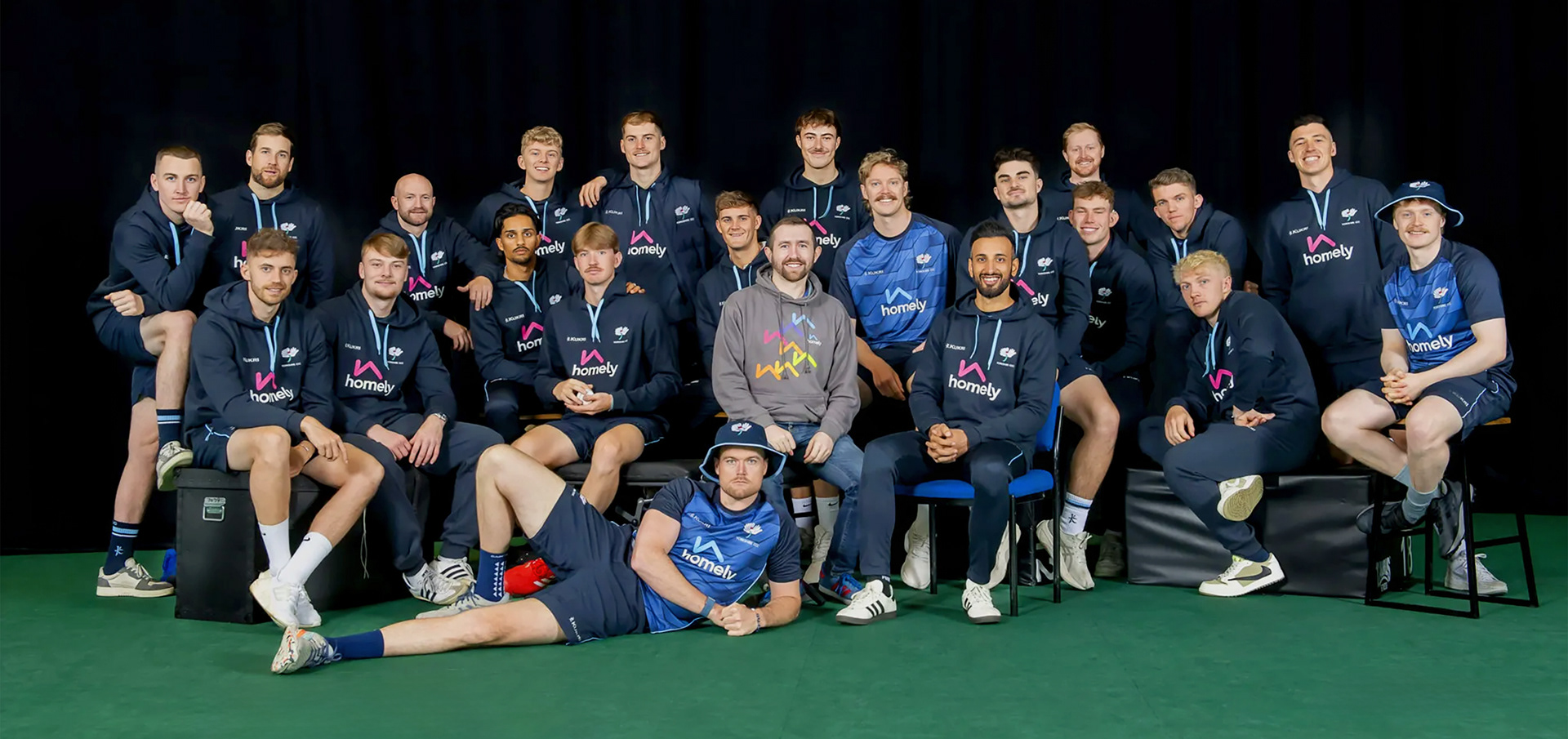
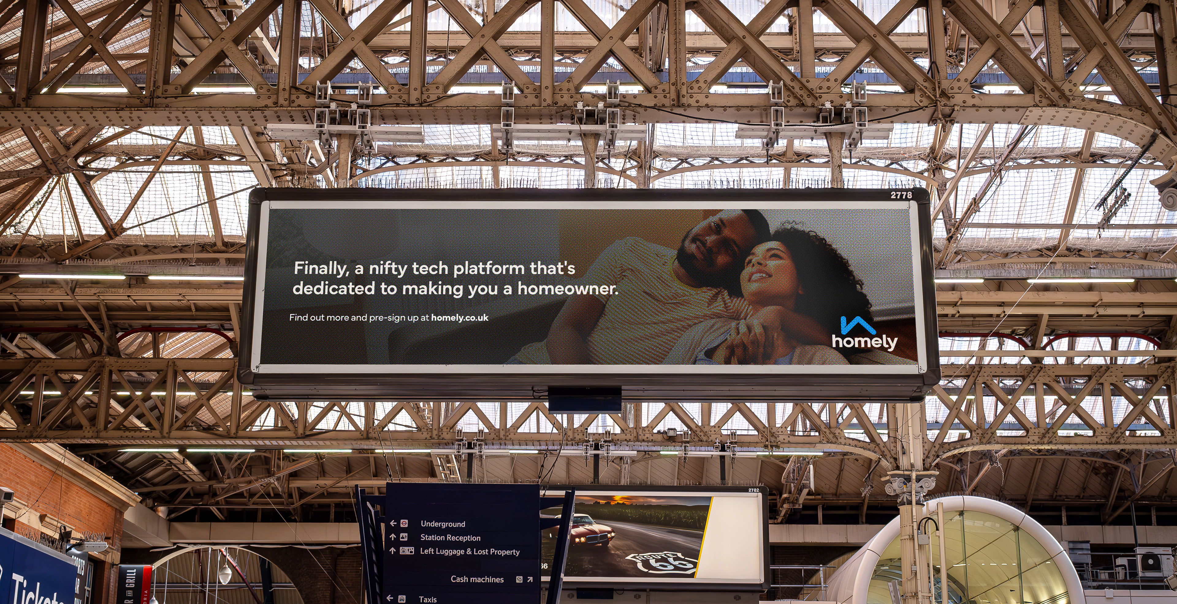
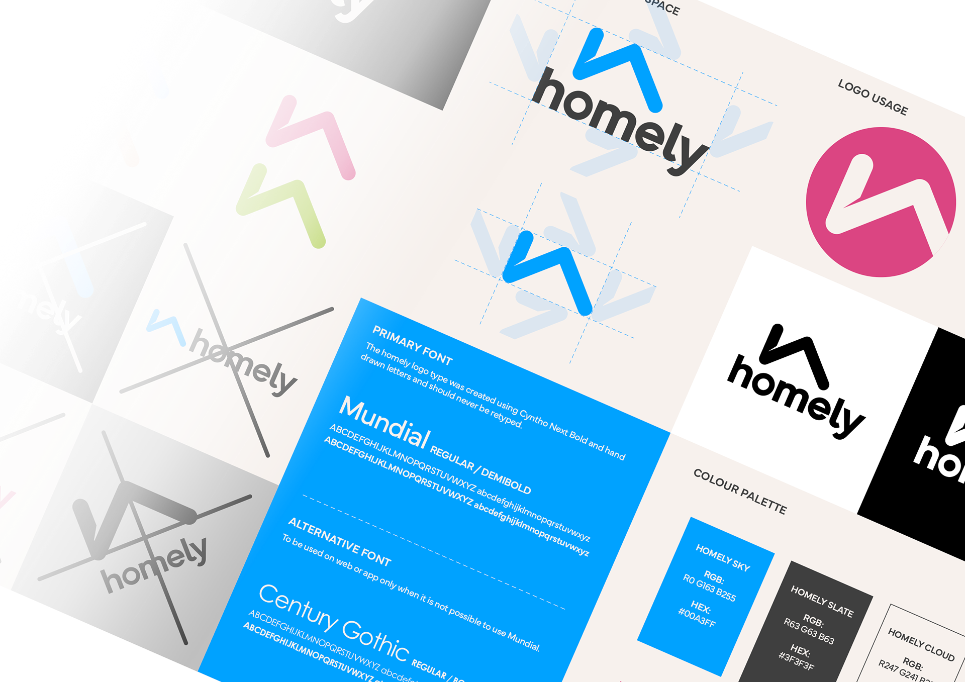
Logo refresh, basic guidelines, web/app UI and marketing
Homely is a fully digital, end to end residential real estate platform, using proprietary technology and data
to empower individuals to home ownership
They approached me to improve and rationalise its brand offering prior to the launch of their innovative platform. I refreshed their logo in collaboration with the founders, created the pre-launch website, photo and video shoot art direction and all marketing collateral and merchandise.
The challenge
I was initially tasked with helping to develop a cohesive brand identity based on the existing logo and some wooly company blurb. This foundation would guide the creation of social and marketing assets that aligned with the new brand style.
The approach
To start, I delved into understanding the target audience and researched companies in similar industries. Homely aimed to differentiate itself in the crowded property market by adopting a fresh, disruptive approach similar to a tech company targeting Gen Z. This vision needed to be balanced with establishing trustworthiness, emphasising reliability in handling financial futures.
I quickly concluded that more needed to be done to realise the companies objectives. After some discussion they agreed that the current logo and palette needed to be refreshed in-order to create a brand fit for purpose.
I quickly concluded that more needed to be done to realise the companies objectives. After some discussion they agreed that the current logo and palette needed to be refreshed in-order to create a brand fit for purpose.
The solution
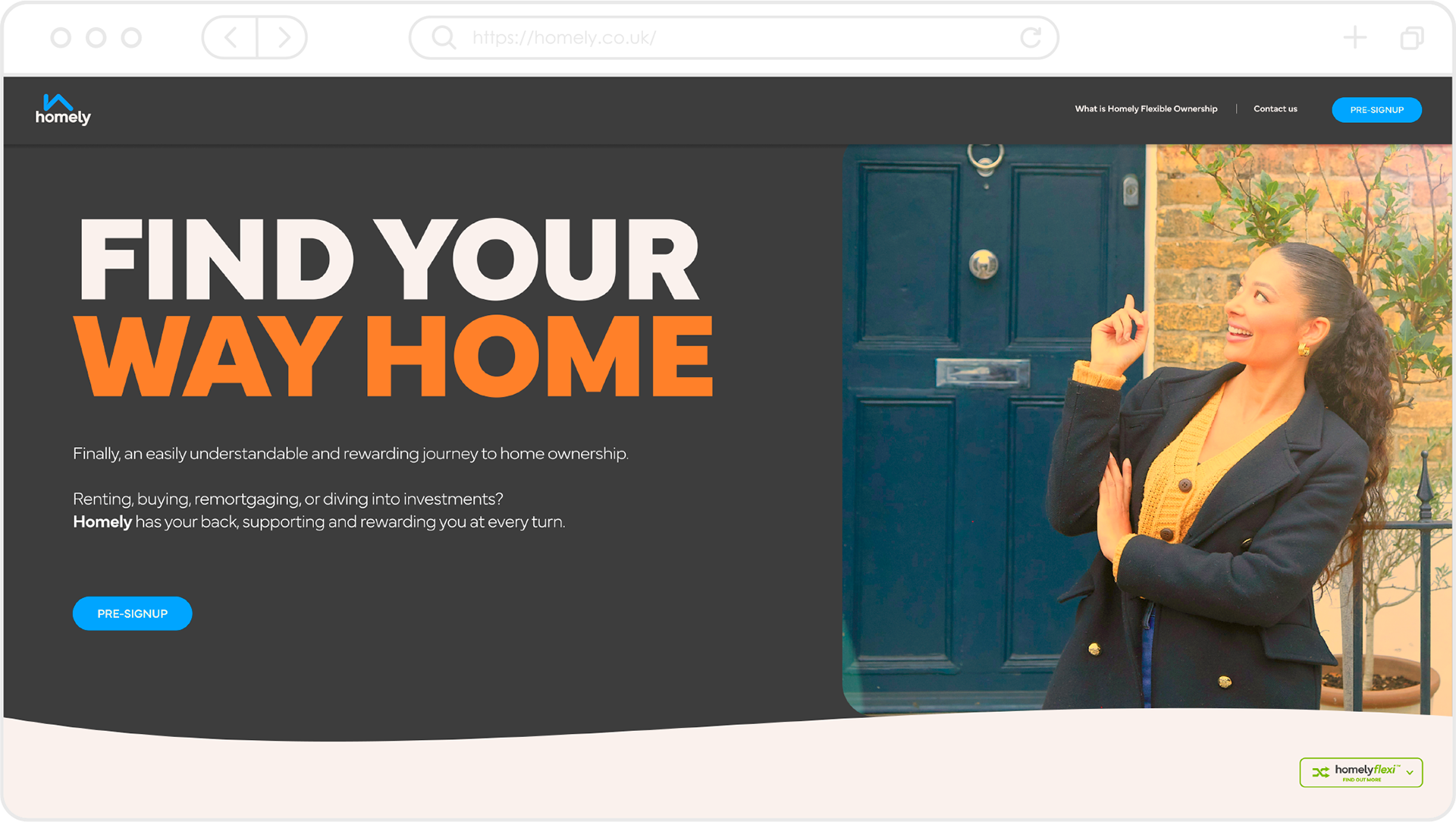
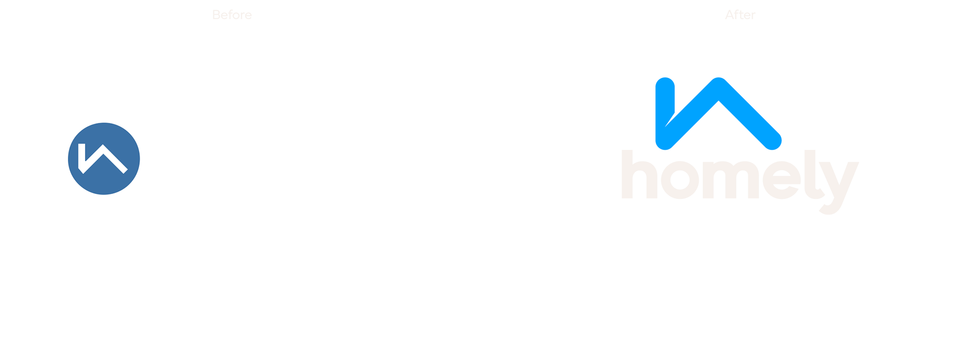
Homely wanted to retain the essence of the original design and were particularly keen on preserving the ‘h’/roof device and lowercase type. My goal was to create a more cohesive logo with a logotype and icon that would be powerful enough to stand independently once the brand was established. To achieve this, I moved the elements closer together to form a unified vertical mark. I removed the ‘h’ device from the circle to give it more prominence and flexibility, rounded off the corners, and added a slice to emphasise the chimney and roof effect. For the type, I retained a similar font, Mundial, but made it bolder and trimmed the ascenders slightly to create a more compact and dynamic wordmark.
The final logo is now strong enough to serve as the foundation of the brand identity. It has a professional and modern look while also possessing a sense of familiarity that effectively conveys trustworthiness.